ORBIT-UI
Frontend design system and component architecture
CSS-first design system built with Astro and Tailwind CSS v4, based on semantic design tokens, reusable components, and explicit usage contracts.
1. Summary
ORBIT-UI is a frontend design system built with Astro and Tailwind CSS v4. The project combines semantic design tokens, reusable components, and explicit composition rules to build consistent interfaces with minimal client-side JavaScript.
The project prioritizes consistency, complexity control, and reuse over the number of available components. Rather than being only a visual component catalog, ORBIT-UI explores an architecture for building and documenting frontend design systems.
2. Problem and Objectives
Frontend projects can accumulate duplicated styles, visual inconsistencies, and multiple solutions to the same problems as they grow.
ORBIT-UI addresses this through:
- Semantic design tokens that represent visual meaning.
- Reusable components with defined properties and states.
- Explicit contracts documenting valid and invalid usage.
- CSS-first implementation to avoid unnecessary JavaScript.
- Documentation integrated directly into the project.
The main objective is to explore how component and token architecture can maintain consistency without turning the design system into an unnecessarily complex abstraction layer.
3. Solution
ORBIT-UI is structured around three main elements:
Design Tokens
CSS tokens represent visual meaning rather than specific values.
The system includes categories such as:
- Surface — backgrounds and containers.
- Text — content hierarchy.
- Accent — interactive elements.
- Status — feedback states.
- Typography — font families.
Tokens are defined through Tailwind CSS v4’s CSS-first configuration and consumed by the components.
Components
The system includes 10 base components:
- Button
- Card
- Alert
- Badge
- NavLink
- Input
- Select
- Modal
- Table
- Tooltip
Components define documented variants, states, and properties to reduce inconsistent implementations.
Documentation
Documentation is part of the same project and includes:
- System principles.
- Design tokens.
- Component catalog.
- Variants and states.
- Usage examples.
- Contracts and anti-patterns.
4. Architecture
ORBIT-UI uses a three-layer architecture:
Design Tokens
     │
     ▼
UI Components
     │
     ▼
Documentation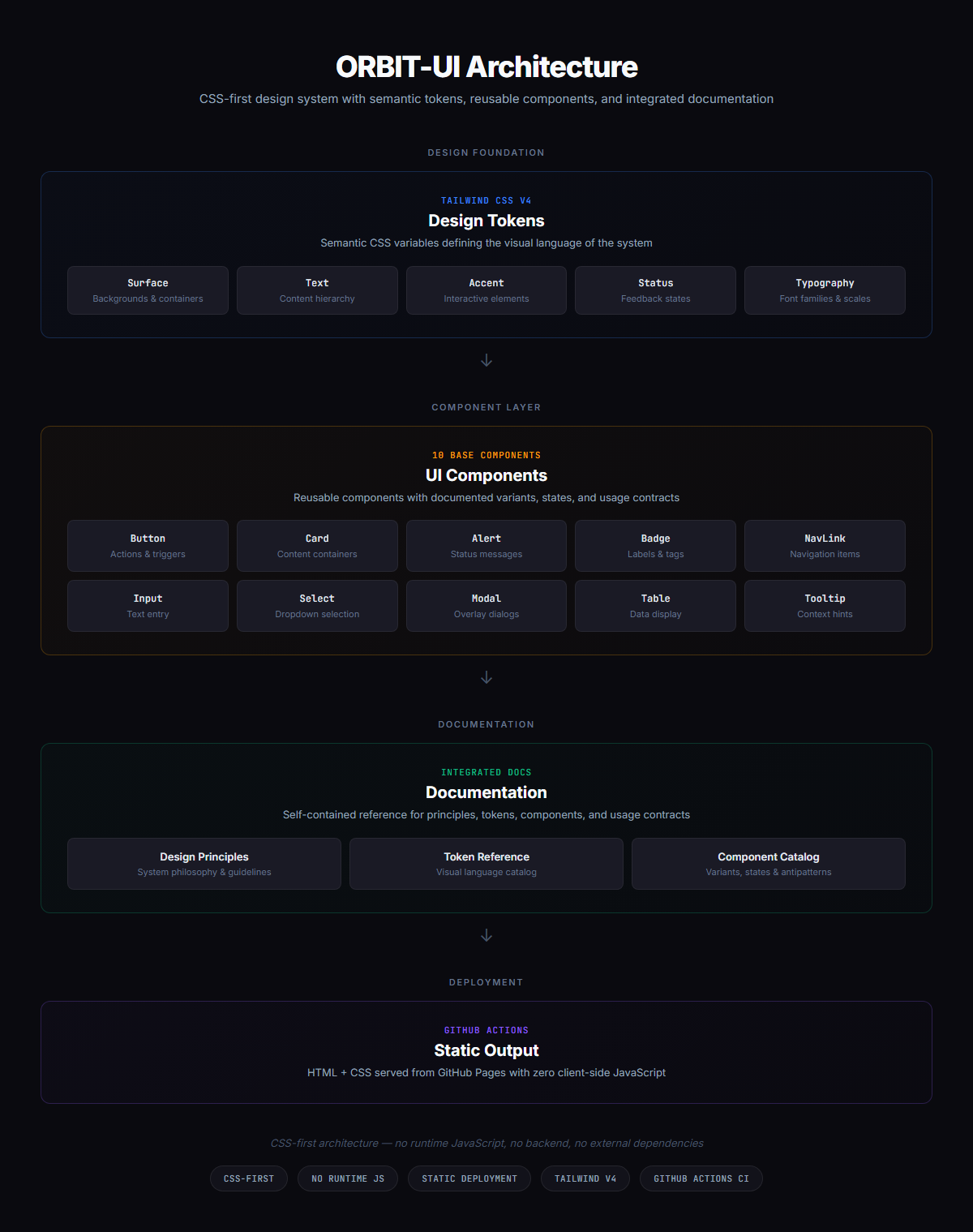
Token Layer
Defines the visual language of the system through semantic CSS variables.
--color-surface-main
--color-surface-elevated
--color-text-primary
--color-text-muted
--color-accent-primary
Components consume these tokens instead of depending directly on specific visual values.
Component Layer
Astro components consume the tokens through documented variants, properties, and states.
Most components work without client-side JavaScript. Modal uses the native <dialog> API with a minimal interaction layer.
Documentation Layer
Astro pages document component behavior and usage together with examples, contracts, and anti-patterns.
Documentation is built and deployed alongside the system, keeping implementation and documentation within the same project.
5. Technology Stack
| Technology | Purpose |
|---|---|
| Astro | Site generation framework |
| Tailwind CSS v4 | Utility styling and token configuration |
| TypeScript | Component property typing |
| Vite | Build tooling used by Astro |
| pnpm | Dependency management |
| GitHub Actions | Automated build and deployment |
| GitHub Pages | Static hosting |
Typography
- Inter
- JetBrains Mono
6. Implemented Features
Token System
- 14 semantically organized color tokens.
- 2 typography tokens.
- Surface, Text, Accent, Status, and Typography categories.
- CSS-first configuration through
@theme.
Components
- Button with variants and states.
- Card with multiple presentation variants.
- Alert for information and feedback states.
- Badge for semantic states.
- NavLink with active route detection and
aria-current. - Input with disabled and invalid states.
- Select with validation.
- Modal based on
<dialog>. - Table using semantic element composition.
- Tooltip with multiple positions and hover/focus support.
Documentation
- Component catalog.
- Individual component documentation.
- Variant and state examples.
- Composition guidelines.
- Anti-pattern documentation.
- Reusable code snippets.
7. Technical Decisions
CSS-First Architecture
Most components are implemented through HTML and CSS, using JavaScript only where interaction requires it.
Benefit: reduces client-side JavaScript and keeps base components simple.
Trade-off: more complex interactions require additional logic and are currently outside the system’s scope.
Semantic Tokens
Tokens represent visual meaning, for example:
--color-text-mutedrather than specific values such as:
--color-gray-400Benefit: allows the visual language of the system to evolve without coupling it to individual components.
Trade-off: developers need to understand token semantics to use them correctly.
Explicit Component Contracts
Components document variants, states, valid usage, and anti-patterns.
Benefit: the system defines composition rules in addition to visual styles.
Trade-off: it requires more discipline and documentation than an unrestricted component collection.
Documentation-as-Code
Documentation lives within the same project and is generated through Astro.
Benefit: implementation, examples, and documentation evolve together.
Trade-off: documentation depends on the project’s build system.
8. Accessibility and Quality
ORBIT-UI incorporates accessibility foundations directly into its components through:
- Semantic HTML.
aria-current.aria-invalid.aria-label.aria-hidden.aria-disabled.- Semantic roles where appropriate.
- Documented interactive states.
The project does not yet include an automated component testing suite, visual regression testing, or automated accessibility auditing.
This is considered a current limitation and is not presented as a guarantee of complete accessibility.
9. Visual Evidence
Overview
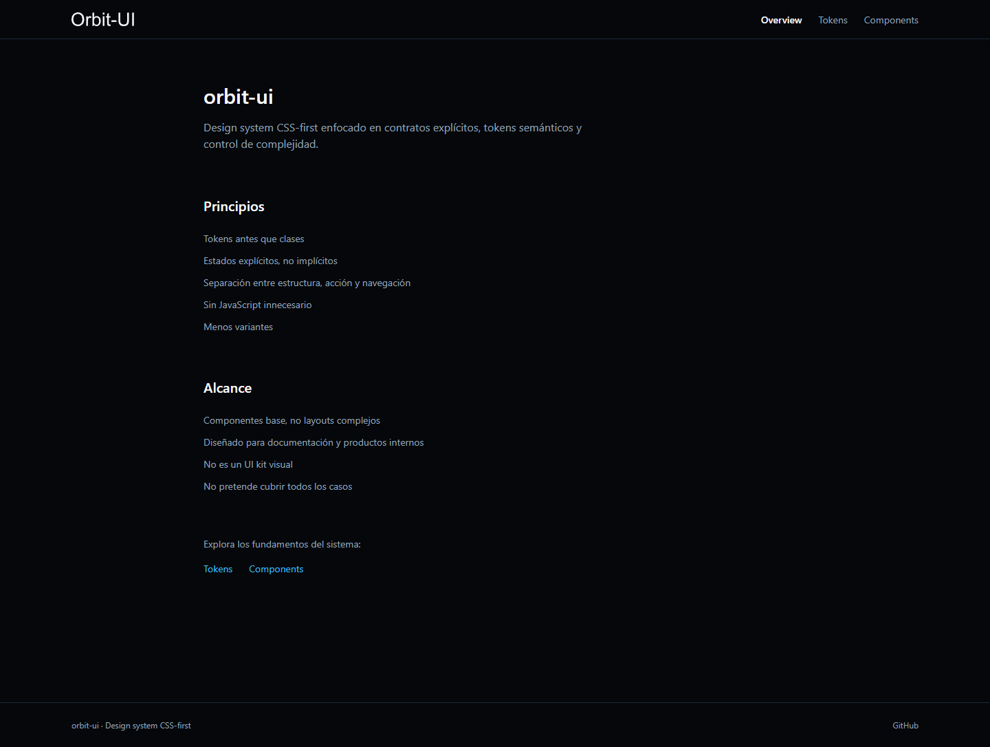
Main system page showing its structure, principles, and navigation.
Design Tokens
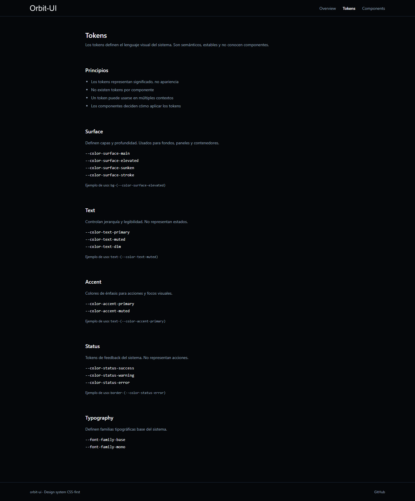
Semantic token system used as the visual foundation for the components.
Components
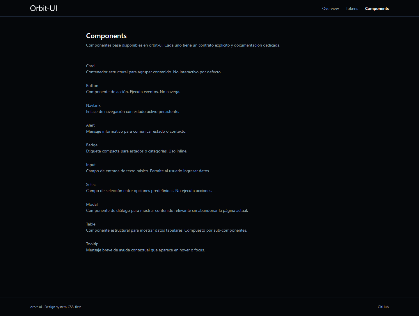
Component catalog and available variants.
Component Documentation
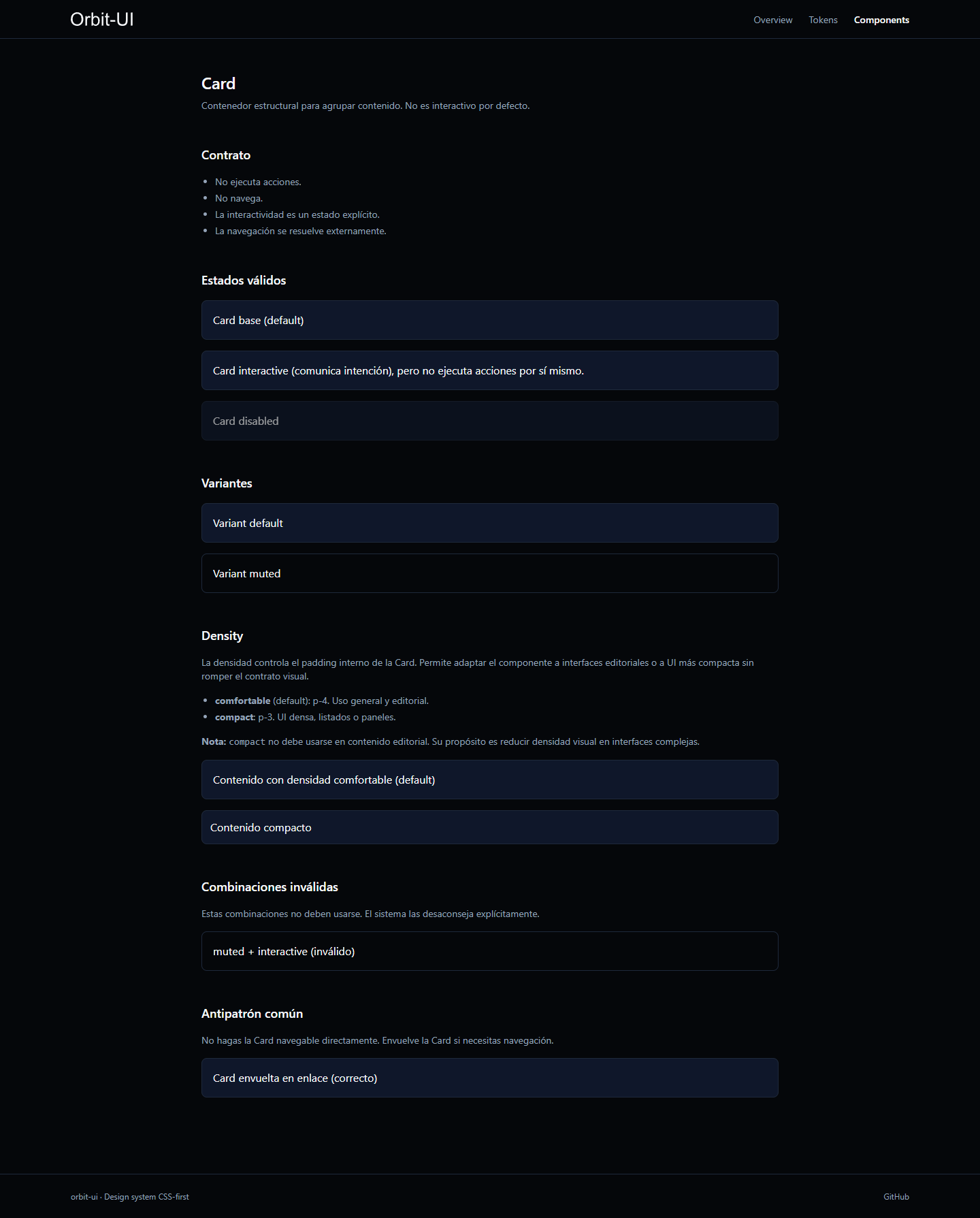
Component documentation showing variants, states, contracts, and usage rules.
Modal
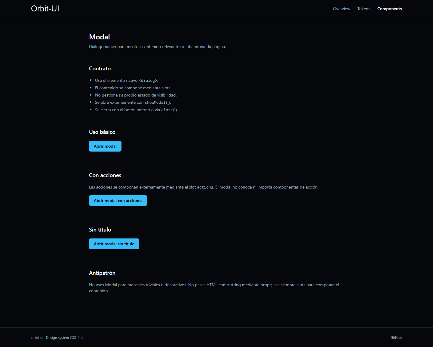
Modal interaction using the native <dialog> API.
10. Current Status and Limitations
Status: Active Development.
ORBIT-UI is a functional design system with implemented components, integrated documentation, and a public deployment.
It currently does not include:
- Automated component test suite.
- Automated accessibility auditing.
- Visual regression testing.
- Advanced interactive components such as Tabs, Dropdown, or Toast.
- Documentation search.
- Internationalization.
- Formal component versioning strategy.
- Token export for other frameworks.
Given its current scope, the project is presented as an implementation and exploration of frontend design system architecture rather than a complete enterprise design system.
11. What This Project Demonstrates
ORBIT-UI demonstrates experience with:
- Design system architecture.
- Frontend development with Astro.
- Tailwind CSS v4 and
@themeconfiguration. - Semantic token design and organization.
- Reusable component architecture.
- TypeScript for component contracts.
- CSS-first development.
- Semantic HTML and accessibility foundations.
- Documentation-as-code.
- Static site generation.
- Automated build and deployment with GitHub Actions.
The main technical value of the project is demonstrating that a design system can define not only visual components, but also reusable composition rules and a shared visual language.